Vasudev M G, Remidio’s Head of Design shares the process adopted by his team to rebrand Remidio in “The story behind our new look”. Get to know more on how Remidio preserves the philosophy of metamorphosis and collectively our design elements speak Remidio’s language, “Make it simple”
Remido’s novel and easy-to-use solutions help eliminate preventable blindness. Over the past decade, our solutions have impacted more than 7.5 million patients across 15countries.
We blend design thinking and cutting-edge technology to deliver the best yet simple solutions addressing eye screening needs for the broadest possible audience. Operating within the med-tech space, it is essential to gain users’ trust, and therefore, having a consistent and recognizable identity is paramount to our growth.
The need
In the last ten years, Remidio has evolved as more than a start-up. Its identity needed to reflect the attributes whilst retaining the flexibility to be applied across multiple touchpoints. Remidio provides eye wellness solutions based on the significant problems the doctors and healthcare providers face every day. It thrives to enhance the screening and diagnosis experience for all partakers, including patients. Remidio’s focus on delivering products that impact the lives of millions makes it more than a hardware or software solutions provider.

The core philosophy of Remidio’s identity is metamorphosis. The combination of the logo mark — the butterfly and the letter ‘M’ does the recall, but the essence was found to be incomplete. The adaptability was limited, and the lack of guidelines further diluted the brand values.
One of the go-to places for a customer seeking answers is often the corporate website. However, the time a customer spends on the website is limited and precious. At Remidio, the previous web page discussed the current situation and opportunities, but our work warranted us to communicate our solutions and on the ground impact.
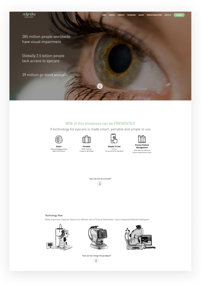
As we operate in a niche market, the brand identity is often misunderstood to be less critical. However, ushering in brand guidelines and structured marketing materials improves the credibility of the organization.
Across industries, the target audience has become empowered consumers, and the competition to match up to their expectations has become increasingly fierce. As a result, demand for a strong market presence and a strong brand is high.
The learnings and freedom of work are remarkable at Remidio. But the lack of a well-defined and effectively communicated employer brand often makes it harder to attract the industry’s top talent.
Brand story
We began to intensely study what Remidio has already achieved and what is our next phase. We connected with everyone within Remidio to gather opinions on how we would describe our values. We also tried to know how they would describe the character of Remidio if it’s a person.
We collaborated closely with management teams. Then, we discussed how our products and services are helping people to function better and make progress with their lives. All of this led to defining a brand storyboard.
We went on to define our attributes — started with a list of qualities that everyone could associate with Remidio. Subsequently observed Remidio operate at the micro-level and learned how employees interact with each other, how they function as a team, how they represent our customers. Finally, we distilled down all these observations to a much leaner set of three core values. The values everyone could associate with Remidio.

Bold
Our biggest successes are the result of bold decisions taken in the face of uncertainty. We are bold to question ourselves and grow. We do not hesitate to share our thoughts for better product development and customer experience.
Open
We are always interested in new relationships and opportunities. We make it a practice to accept constructive criticism and use it to improve our skills.
Dynamic
Remido is always a buzzing environment, with a plethora of interactions and initiatives going on simultaneously. We quickly adapt to new requirements or technologies, allowing us to stay ahead of the competition. When it comes to solving difficulties, we don’t keep to a single method. Instead, we push ourselves to be highly adaptable to exceed our goals.
Designing our mark
Before, Remido’s logo mark was a butterfly embedded in the letter ‘M’. Spotting the ‘M’ was often a challenge but once it was, the uniqueness lingered. We wanted to preserve the philosophy of metamorphosis — the rapid and extreme changes we undergo as part of our evolution.
Also, the colour green gave Remidio an identity, and we retained it as the primary colour for the new identity.
The process was long. We tried help from a few great brand consultants. As a result, we received a few excellent identity mark designs but could not find the real ‘Remidio’ in any of them. We were not able to communicate well about who we are and the story of our evolution. The only alternative was to look inward. Dr. Anand Sivaraman, Remidio’s CEO, believed in the team and encouraged us to create the identity in-house. That sparked our exploration. The vision of the organization is to make eye care accessible and simple. We wanted to design a logo that reflects this and communicates our values — ‘bold, open and dynamic’
The explorations
We spent many weeks iterating and connecting different concepts, sketched and designed a lot of options. We derived various links and customer connections with the brand. We tried to interpret the brand from different perspectives.

Our core identities, the butterfly and the primary green colour had to be retained for brand continuity. We also considered the extremes of the concepts within this boundary. Creating concepts that are related to eye care was at one end of the spectrum, while abstract and contemporary designs that do not directly relate to the domain were at the other end.

It was then time to decide on the identity direction we wanted to take. Either we could stick to the concepts that are derived from the domain where we make a constant impact, or we could reflect the core idea of the brand- making healthcare simple- by going ahead with a concept that portraits the vision of the brand.
We came up with around 17 different possibilities, and deciding on the best one was the most difficult part. To do so, we created a list of the primary characteristics we believe a logo should have and asked the team to assess each logo based on those characteristics.
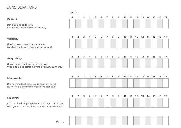
Using the evaluation matrix, the team evaluated the logo options and picked the best-rated one. We then detailed and derived variants of that logo.

It was well-received by the team, but something was not quite right. It did not take long before we realized it was the simplicity that we needed.
The final design
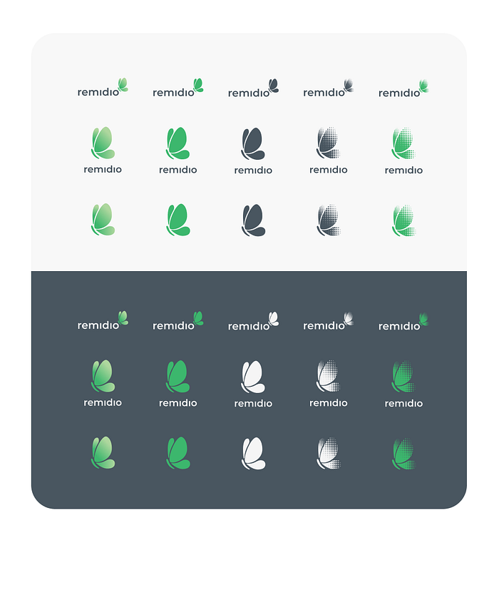
This logo breaks down the form of the butterfly into minimal organic units. A play of scale gives the form visual interest, while the chosen colour palette brings the team a sense of liveliness and warmth.

The font had to be chosen carefully to match our brand and the style of our logo. Since the logo mark represented simplicity and dynamism, the letter mark incorporated the other brand attribute- boldness.
The font had to be chosen carefully to match our brand and the style of our logo. Since the logo mark represented simplicity and dynamism, the letter mark incorporated the other brand attribute- boldness.

The solid, geometric logotype communicates stability. Subtly rounded corners and smooth edges evoke a feeling of friendship and trust.

Typography
Noto is a global font collection for writing in all modern and ancient languages. In addition, this sans serif font has broad support for Indic scripts. Noto Sans is Remidio’s primary typeface. The web, applications, documents, presentations, letters, and other digital communication materials use this as the primary font.
Noto Serif is our alternate font for marketing use. This font family is the voice of Remidio in the human context.

Colour Palette
We wanted our palette to feel vibrant and fresh whilst also using colours to communicate brand characteristics to the audience. The Emerald green, guava green and tarmac grey of our new primary palette convey far more life than our old pale and muted palette, which we feel is a far more suitable voice for Remidio.

To bring more vibrance to our visual communication, we also created a secondary colour palette. This colour and the gradients focus on driving suitable attention to the brand in a subtle manner.

Defining a signature
Remidio involves its customer in the early stages of product development, and it’s the trust and belief they have in us is that drives us to achieve larger goals. Trust is a critical business and brand asset, especially in the relationship with the customers and patients. So, in this new phase of Remidio’s journey, we wanted to craft an embodiment for this trust. We wanted a physical representation of the link between the need and the solutions. And we call it ‘The Ring of Trust’.
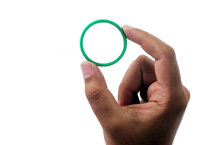
Every product of ours spots the green ring. It is a loop that connects us, the customers, and the millions of people who get benefited. And internally, it’s a symbol of our commitment to the customer. It’s the signature of quality and trust. This ring’s subtle yet direct presence on all our products unites them under the same family and accentuates the brand visibility.

Illustrations
We introduced a simple, scalable style of illustrations to help explain the products. The simple re-creatable style allows us to make quick designs and communicate faster.

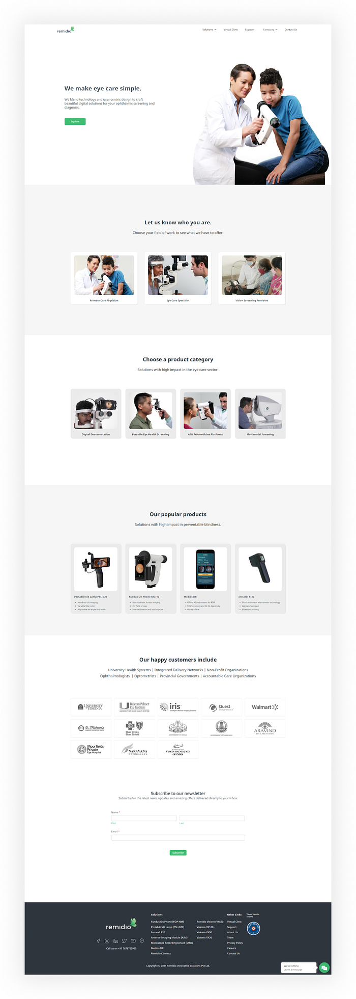
The Website
We recreated the entire flow for the website and improved the user interaction experience. Instead of focusing on the situation, we talked about the solutions we provide. We restructured the navigation based on the visitors’ interests. While we evaluated fundamental accessibility factors like font, size, colour, and navigation, our primary focus was to highlight the human connection we bring in through our solutions. The product pages talk more about the benefits and use cases. The entire website is developed on Webflow, and the first version of the site is live.
Internal Branding
When we think of a brand, we usually think of how a company presents itself to customers, prospects, and consumers and how our organization is recognized in general. Employees, on the other hand, are at the heart of our brand. Remidio employees work very closely with doctors and other stakeholders. We see the value of a good brand in everything from the ‘Mission Statement’ to the most modest of employee goodie gifts. We updated our ID cards, visiting cards, document templates, and introduced personalized mugs and T-shirts as the first step.

Steps ahead
It is undoubtedly a proud moment to have completed most of the brand-related tasks; however, there are still a few to finish up. The application UI and the product packaging designs are the major ones that need to be revised based on the new identity. Besides implementing the brand elements, we also take conscious steps to make our products more accessible and sustainable. — More on that later.

